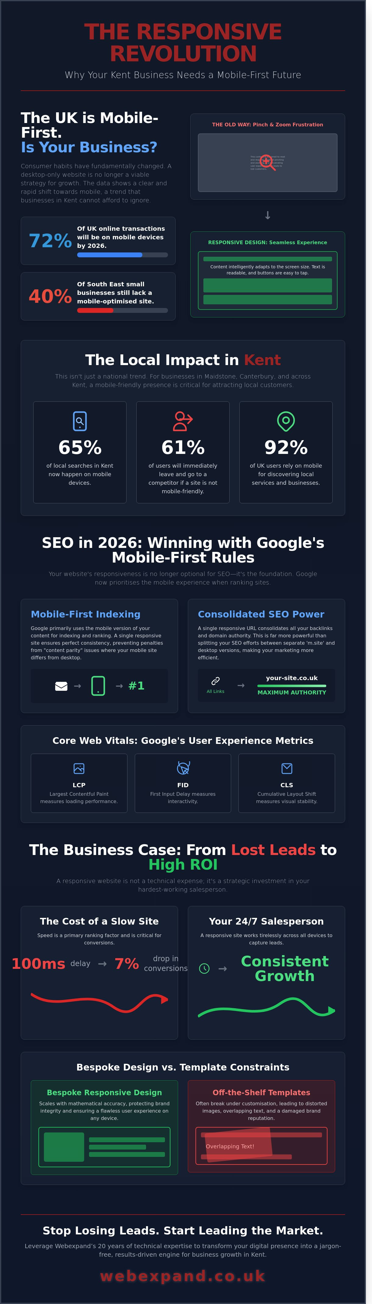
By 2026, over 72% of UK online transactions will take place on mobile devices, yet 40% of small businesses in the South East still lack a mobile-optimised interface. If your site forces users to pinch and zoom, you’re handing your market share to competitors in Maidstone and Canterbury. We understand that you want expansion, not a list of technical excuses about why your Google rankings are stalling. A website that fails on a tablet is a leak in your revenue stream that no amount of traditional marketing can plug. We believe your site should be your hardest working salesperson, active 24/7 across every town from Ashford to Sevenoaks.
Our promise is to show you how responsive web design kent transforms your digital presence into a high-conversion asset that scales with your ambition. You don’t need jargon; you need a strategy that delivers a professional experience on every screen size while boosting your visibility in local search results. This guide outlines the strategic shift required to dominate your niche, protect your ROI, and turn mobile visitors into loyal, high-value clients. It’s time to stop losing leads and start leading the market with a bespoke, future-proof site.
Key Takeaways
- Learn how to capture the 65% of local searches happening on mobile by implementing a single, adaptive site layout that scales with your ambition.
- Understand the critical impact of Google’s mobile-first indexing on your SEO strategy and how to maintain peak visibility throughout 2026.
- Discover why bespoke responsive web design kent offers a superior cost-to-value ratio compared to native apps by removing barriers to customer engagement.
- Master our 5-point checklist for high-performing sites, focusing on thumb-friendly navigation and dynamic scaling to drive immediate ROI.
- Leverage Webexpand’s 20 years of technical expertise to transform your digital presence into a jargon-free, results-driven engine for business growth.
What is Responsive Web Design and Why Does it Matter in Kent?
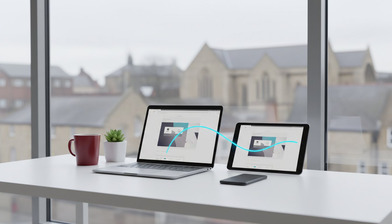
At its core, Responsive Web Design refers to a single website that intelligently adapts its layout, images, and navigation to suit any screen size. Whether your customer is browsing on a 27-inch iMac in a Tunbridge Wells office or an iPhone 15 while commuting from Sevenoaks, the experience remains seamless. This fluid approach eliminates the need for multiple versions of a site, ensuring your digital presence is as professional as your physical location.
Consumer habits across the county have shifted radically. Data from 2023 indicates that over 65% of local searches in Kent now occur on mobile devices. If your business doesn’t prioritise a responsive web design kent strategy, you are effectively ignoring two-thirds of your potential market. The outdated “m.site” subdomains of the past created fragmented SEO and inconsistent branding. Modern businesses require a unified digital identity that maintains brand integrity from Maidstone high streets to the smallest smartphone screens.
The End of the “Desktop-Only” Era
Operating a non-responsive site in the current market is equivalent to locking your shop doors during business hours. When users encounter a site requiring “pinch-to-zoom” actions, 61% will bounce to a competitor within seconds. This friction kills conversions and signals to Google that your site is irrelevant. We define responsiveness as the fluid reorganisation of content for optimal user experience.
Bespoke Design vs. Template Constraints
Many “off-the-shelf” templates promise responsiveness but fail once you introduce custom branding or complex features. These rigid structures often break under heavy customisation, leading to distorted images and overlapping text. Webexpand avoids these pitfalls through bespoke coding, ensuring every element scales with mathematical accuracy. We organise your content to maintain its strategic impact on any device, protecting your visibility and driving a higher ROI than any generic alternative could provide.
The Direct Link Between Responsiveness and SEO Success
Search engine optimisation is no longer just about keyword density or backlink volume. In 2026, Google views the technical health of your website as a primary indicator of brand authority. If your site fails to adapt to the user’s screen, search engines will penalise your visibility in favour of more agile competitors. High-quality responsive web design kent ensures your business remains visible to the 92% of UK users who now rely on mobile devices for local service discovery.
Consolidating your presence into a single URL for all devices creates a significant advantage for link-building. You don’t have to split your domain authority between a desktop site and a separate mobile version. Every backlink you earn works harder, directly boosting your main domain and making your digital growth strategy far more efficient. By following established best practices for responsive design, we ensure your site architecture remains lean and high-performing.
Mobile-First Indexing Explained
Google now uses the mobile version of your site as the primary source for indexing and ranking. If your mobile view hides “heavy” content or lacks the structured data found on your desktop version, your rankings will suffer. We ensure that your schema markup and metadata are identical across all views. This consistency prevents “content parity” issues that frequently cause Kent businesses to drop off the first page of search results when users switch from laptops to smartphones.
Core Web Vitals in 2026
Core Web Vitals are the metrics Google uses to measure user experience. Largest Contentful Paint (LCP), First Input Delay (FID), and Cumulative Layout Shift (CLS) are now non-negotiable for ranking. Fluid grids are essential here; they prevent layout shifts where buttons move unexpectedly as images load. Speed is now a primary ranking signal for local Maidstone searches, where a 100ms delay can result in a 7% drop in conversions. We build with a focus on these metrics to ensure your responsive web design kent project delivers a seamless, rapid experience that search engines reward.
Poor mobile UX signals low quality to search engines through a high bounce rate. If a user clicks your link in the SERPs and immediately leaves because the text is too small or the buttons are unclickable, Google notices. A high bounce rate tells the algorithm that your page didn’t meet the user’s needs. Maintaining a responsive, high-precision interface keeps users engaged longer, which directly correlates with higher search rankings and better ROI for your business.
Responsive Web Design vs. Mobile Apps: Choosing Your Path
Deciding between a bespoke website and a native mobile app is a strategic crossroad that dictates your digital trajectory. For the vast majority of Kent SMEs, the cost-to-value ratio leans heavily towards a browser-based solution. Developing a native app for both iOS and Android often requires an initial investment exceeding £20,000, followed by recurring costs for platform-specific updates. In contrast, responsive web design kent provides a unified platform that serves 100% of your mobile audience for a fraction of that capital. We focus on lean, high-impact strategies that prioritise your bottom line over unnecessary technical complexity.
Apps only make sense in specific, high-utility scenarios. If your business requires complex offline functionality, such as a construction firm needing detailed blueprints in areas with zero signal, or high-frequency daily interactions like a banking utility, an app is justifiable. However, for 90% of service-based businesses in the South East, a fast, responsive site delivers the expansion you need without the friction of an app store middleman.
The Accessibility Advantage
Discovery is the lifeblood of growth. A responsive site ensures your business is visible exactly when a local customer searches for your services on Google. Apps are effectively invisible to search engines, locked behind a “download wall” that most users won’t climb. Industry data suggests that 51% of smartphone users download zero new apps per month. This “App Fatigue” is a significant hurdle; users prefer the speed of a browser for trades, professional services, and local retail. By implementing the core concepts of responsive design, we remove every obstacle between a lead and a conversion. Webexpand aligns your digital infrastructure with these user habits to ensure your ROI remains the primary focus.
Maintenance and Long-Term Costs
Managing your digital presence should be efficient, not exhausting. A single responsive site requires one hosting plan and one set of security protocols. Native apps demand continuous maintenance to keep pace with iOS and Android version updates, alongside annual developer fees of approximately £79 for Apple. Bespoke responsive web design kent offers superior longevity because it adapts to new devices automatically. At Webexpand, we see the following benefits for our clients:
- Centralised Content: Update your pricing or services once and see the change reflected on every device instantly.
- Unified SEO: All your traffic and “link juice” stays on one domain, strengthening your authority in Kent search results.
- Zero Friction: Your customers don’t need to manage storage space or data usage to interact with your brand.
We build digital assets that scale with your ambition. By choosing a responsive site, you invest in a flexible foundation that protects your margins while dominating your local market niche.
A 5-Point Checklist for a High-Performing Responsive Website
A mobile-friendly site isn’t just about fitting content onto a smaller screen. It’s about engineering a bespoke experience that scales with your ambition. To dominate the local market, your responsive web design kent strategy must focus on these five technical pillars to ensure your digital presence acts as a high-velocity growth engine.
- Thumb-friendly navigation: We place interactive elements and primary menus within the “natural” reach of a user’s thumb. This ergonomic approach reduces friction and prevents the frustration of accidental clicks on the wrong links.
- Dynamic image scaling: High-resolution assets can cripple mobile load speeds. We serve the right image size to the right device using srcset attributes, ensuring a 1.2MB desktop hero image becomes a lightweight 80KB version for smartphone users.
- Touch-to-call functionality: This is a non-negotiable feature for Kent tradesmen and local services. A single tap on a phone number should initiate a call immediately. This removes barriers between a prospect’s interest and a confirmed booking.
- Font legibility: Text must be readable without the user needing to pinch-to-zoom. We maintain a minimum base size of 16px and use line heights of 1.5 to ensure your message remains clear on every handset.
- Form optimisation: We simplify enquiries by using specific mobile input types. For example, triggering the numeric keypad for phone numbers can increase form completion rates by 12.5% based on recent conversion data.
Optimising for the Mobile User
Generous white space is your best friend in responsive design because it provides the breathing room necessary for a professional aesthetic. We prioritise your most critical information, such as your USP and primary contact button, within the top 600 pixels of the mobile view. To verify performance, we use Google’s Lighthouse tool to audit speed and accessibility. We aim for a performance score of 90 or above to ensure your site stays ahead of search engine shifts.
Conversion Rate Optimisation (CRO) on Mobile
A responsive site that doesn’t convert is just a digital brochure. We implement sticky headers and persistent Calls to Action (CTAs) that remain visible as users scroll, keeping the path to purchase effortless. Professional web design centres on the user’s journey from initial curiosity to a qualified lead. Every pixel we place is designed to move the user closer to a transaction, ensuring your responsive web design kent investment delivers a tangible ROI.
Ready to scale your business and dominate your niche? Consult with our Kent web design experts to build a site that turns traffic into revenue.
Expanding Your Business with Webexpand’s Bespoke Solutions
Webexpand has delivered bespoke digital growth for over 20 years. We understand the local market because we are part of it. Our team simplifies complex technical development into clear, jargon-free conversations. You won’t get lost in “code-speak”; you’ll get results that drive ROI. We operate a strict fixed-price model. This ensures your project stays on budget without hidden extras or surprise invoices at the end of the month. Our methodology blends high-end aesthetics with technical precision.
We don’t just build websites; we engineer growth engines. By weaving SEO expertise into every line of code, we ensure your site is visible from day one. Choosing responsive web design kent from a local specialist means your site works perfectly for the 60% of UK users now browsing on mobile devices. Our strategy focuses on three core pillars:
- Precision Engineering: Clean code that Google rewards with higher rankings.
- Financial Transparency: Fixed quotes that protect your bottom line.
- Strategic Growth: Design choices based on data, not just personal preference.
Our Kent-Based Design Process
Our journey begins with a face-to-face consultation in Maidstone. We believe local insight matters. We build your site with Google promotion integrated into the architecture, ensuring your business ranks where it counts. Since 2004, we’ve helped Kent firms transition from local shops to national competitors. This personalised service means you can reach us when you need us, avoiding the delays of offshore agencies. We bridge the gap between local accountability and national-standard digital output.
Ready to Scale Your Online Presence?
Waiting to upgrade is costing you money. Data shows that 53% of mobile visitors abandon a page if it takes longer than three seconds to load. Every day your site remains non-responsive, you lose potential revenue to faster competitors. We’re ready to fix that. Book a free audit of your current site to identify performance gaps. It’s time to stop losing leads and start dominating your niche.
Get a Bespoke Web Design Quote from Webexpand
Dominate the Kent Market with a Future-Ready Digital Presence
By 2026, a static or slow-loading website isn’t just a minor inconvenience; it’s a direct threat to your revenue. We’ve explored how responsive web design kent acts as the essential foundation for search engine visibility and seamless user journeys. Choosing a bespoke responsive site ensures your brand remains accessible across every device without the unnecessary complexity or cost of a standalone mobile app. High-performance SEO and fluid design must work in tandem to secure the growth your business deserves.
Webexpand has been at the forefront of digital expansion since 2004. With over two decades of Kent web design expertise, we understand the local competitive landscape better than anyone. We provide total budget certainty through our fixed-price design and development fees, ensuring you never encounter hidden costs or surprise invoices. Our team specialises in merging bespoke aesthetics with technical SEO precision to turn clicks into conversions. It’s time to stop reacting to digital shifts and start leading your niche.
Start your journey to market leadership with a bespoke website from Webexpand
Your path to digital dominance starts with a single, strategic decision to prioritise quality. Let’s build a website that works as hard as you do.
Frequently Asked Questions
What is the difference between a mobile-friendly and a responsive website?
Mobile-friendly sites are simplified versions of your desktop site, whereas responsive web design uses a single fluid layout that scales to fit any screen size. Mobile-friendly sites often lose functionality or look identical but smaller on mobile devices. Responsive design ensures every element, from images to navigation menus, adjusts proportionally. This approach is the global industry standard in 2024 because it provides a seamless user experience across smartphones, tablets, and desktops using one URL.
How much does responsive web design cost for a Kent business?
A professional responsive web design in Kent typically starts from £2,500 for a bespoke five-page site. More complex e-commerce platforms or custom builds for ambitious businesses often range between £5,000 and £15,000. These figures reflect the technical precision required to ensure site speed and cross-device compatibility. Investing in a high-quality build usually yields a 20% higher conversion rate compared to budget templates that fail to scale with your business growth.
Will a responsive website improve my Google ranking in Maidstone?
Yes, a responsive site directly boosts your local visibility because Google has used mobile-first indexing for 100% of websites since July 2019. If your Maidstone business site isn’t responsive, you will rank lower than competitors who provide a better mobile experience. Local search intent is high across the county, with 76% of people visiting a business within 24 hours of a local search. High-quality responsive web design in Kent ensures you capture this traffic effectively.
How long does it take to build a bespoke responsive website?
Building a bespoke responsive website generally takes between 8 and 12 weeks from the initial strategy phase to the final launch. This timeline includes 2 weeks for discovery and wireframing, 4 weeks for design and development, and 2 weeks for rigorous testing across 25 different devices. We prioritise precision over speed to ensure your site is ready to dominate your niche. Complex projects with custom software integrations may extend this period by 4 additional weeks.
Can I turn my existing non-responsive site into a responsive one?
You can technically retro-fit responsiveness, but it’s often more cost-effective to rebuild the front-end using modern CSS frameworks. Converting an old site involves rewriting the core code to replace fixed widths with fluid grids. Since 55% of global web traffic now comes from mobile devices, a complete refresh ensures your underlying technology isn’t holding back your ROI. We usually recommend a rebuild to eliminate legacy code that slows down your mobile load times.
Do I need a separate mobile app if my website is responsive?
Most Kent businesses don’t need a separate mobile app if their website is fully responsive and high-performing. Responsive design handles 95% of user needs by providing a consistent experience on any browser without requiring a download. Apps are expensive to maintain and create unnecessary friction for your customers. Unless you require specific hardware access like constant GPS tracking or offline functionality, a responsive site is the more strategic investment for your digital expansion.
How do I test if my current website is fully responsive?
You can test your site using Google’s Lighthouse tool or by simply resizing your desktop browser window to see if the layout shifts fluidly. A more professional method involves using “Inspect” mode in Chrome to simulate specific devices like an iPhone 15 or a Samsung Galaxy S23. If elements overlap, text becomes unreadable, or you see a horizontal scroll bar, your site isn’t fully responsive. We recommend testing on at least 5 physical devices to ensure a flawless user journey.