
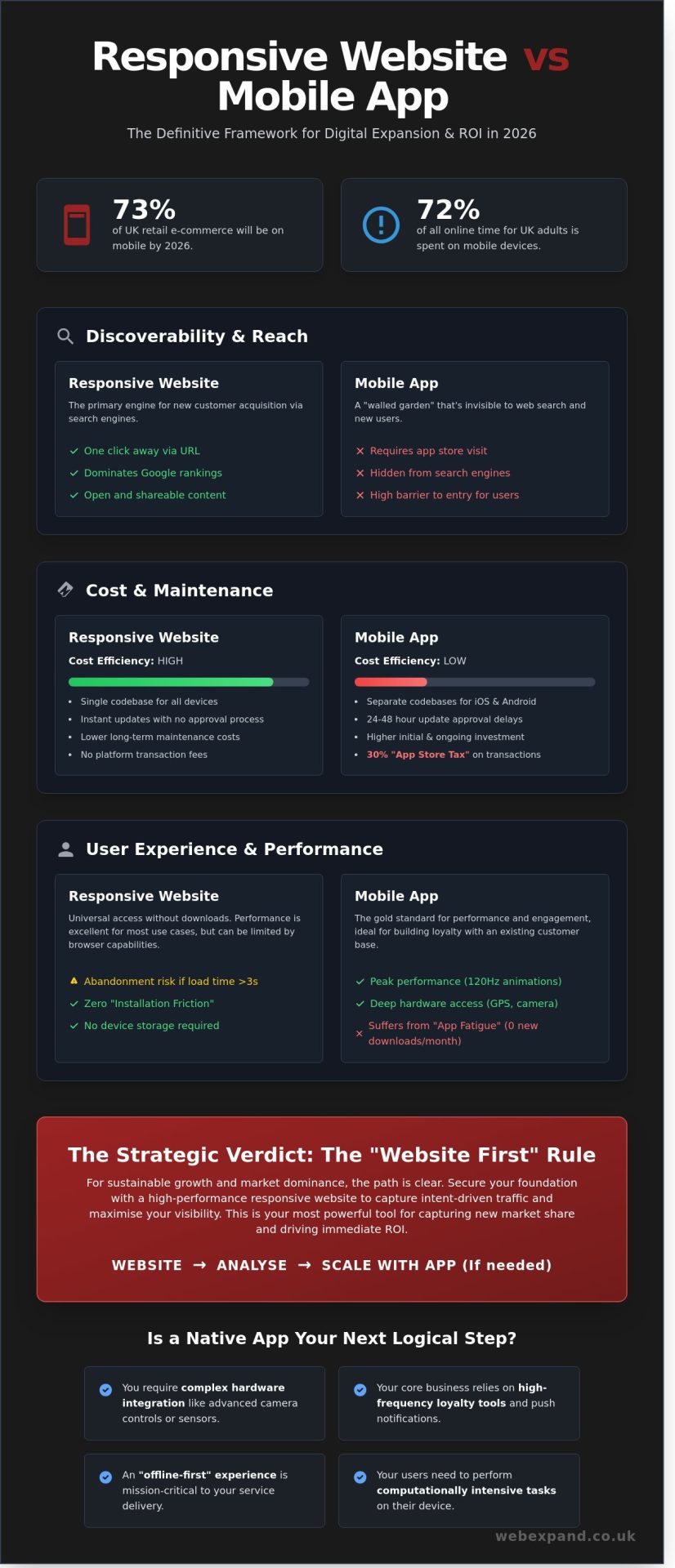
By 2026, mobile commerce is projected to account for 73% of all UK retail e-commerce sales, yet a poorly judged platform choice today can drain your expansion budget by tens of thousands of pounds. You already recognise that a mobile presence is vital for scaling your brand. However, the fear of committing to a technology that limits your future reach or carries hidden maintenance costs is a valid concern for any ambitious leader. The debate of responsive website vs mobile app isn’t just about code; it’s about where your capital generates the highest visibility and conversion.
We’ve designed this definitive framework to strip away the technical jargon and provide a clear, ROI-focused path for your digital expansion. You’ll discover how to choose the platform that secures high Google rankings while delivering the seamless experience your customers demand across every device. We’re moving beyond basic comparisons to give you a data-backed strategy for market dominance and sustainable growth. This is your roadmap to ensuring your digital infrastructure supports your ambition rather than restricting it.
Key Takeaways
- Master the definitive framework for the responsive website vs mobile app debate to ensure your digital strategy delivers maximum ROI and visibility in the 2026 landscape.
- Uncover the hidden financial realities of development, including how to bypass the 30% transaction tax and the long-term cost-efficiency of maintaining a single bespoke codebase in £.
- Learn why search engine dominance is your greatest asset for expansion and how to prevent your brand’s content from being trapped within an invisible “walled garden”.
- Identify the precise performance triggers—from complex hardware integration to high-frequency loyalty tools—that dictate when your business requires a native application to scale.
- Implement the “Website First” rule to capture intent-driven traffic immediately while building a robust, scalable foundation for your journey toward market leadership.
Understanding the Mobile Landscape: Responsive Website vs Mobile App
Your digital presence is the primary engine of your business growth. Choosing between a responsive website vs mobile app is no longer a simple technical box to tick; it’s a strategic decision that dictates how you scale in a mobile-saturated market. A responsive site uses a single codebase that fluidly adapts to any screen size, from a 6.7-inch smartphone to a 32-inch 4K monitor. This flexibility is powered by responsive web design, a standard that ensures your brand looks professional and functions perfectly across all devices. In contrast, native mobile apps are bespoke software packages built specifically for iOS or Android. They live on the user’s device and offer the most direct access to hardware like cameras and haptic sensors.
The 2026 market reality is uncompromising. Recent data from the UK communications regulator, Ofcom, suggests that mobile devices now account for 72% of all time spent online by UK adults. If your platform doesn’t perform flawlessly on a handset, you’re effectively invisible to nearly three-quarters of your potential market. We also see the rise of Progressive Web Apps (PWAs) as a middle ground. These allow you to offer app-like features, such as push notifications and home screen icons, without forcing your customers to visit an app store.
The Core Technical Differences
Accessibility is where the two paths diverge most sharply. A website is one click away via a URL or search result, whereas an app requires a multi-step process: visiting a store, authenticating a download, and waiting for installation. This “installation friction” can reduce conversion rates by as much as 25% for new users. Updates follow a similar pattern. We can deploy a web update to your server instantly, ensuring every visitor sees the latest version of your site. Native apps require mandatory approval processes from Apple or Google, which typically take 24 to 48 hours, delaying your ability to react to market shifts.
- Web Connectivity: Modern caching allows websites to function offline, narrowing the gap with native apps.
- Deployment Speed: Web changes are live in seconds; app changes take days.
- Storage: Websites don’t take up permanent space on a user’s phone, removing a major barrier to entry.
User Behaviour in 2026
The phenomenon of “App Fatigue” has fundamentally changed how we build for you. Recent industry reports indicate that the average UK smartphone user downloads zero new branded apps per month. Users are increasingly protective of their screen real estate, reserving it only for high-utility tools like banking or social media. For retail and service-based expansion, browser-based shopping is where the volume stays. Bespoke web design now allows us to mimic the “premium feel” of an app within a browser, using smooth transitions and gesture-based navigation to keep users engaged. While apps excel at building long-term loyalty with existing customers, your responsive website is your most powerful tool for capturing new market share and driving immediate ROI.
Performance and UX: Where the Platforms Diverge
User Experience is the measure of technical efficiency and emotional resonance that determines if a mobile user converts or abandons your sales funnel. When we weigh the merits of a responsive website vs mobile app, the decision hinges on how your customers interact with data. Native applications execute code directly on the device hardware. This allows for fluid 120Hz animations and complex data visualisations that web browsers often struggle to render without latency. Choosing between a responsive website vs mobile app requires a deep dive into your specific expansion goals and user habits.
Data from 2024 indicates that 53% of mobile visits are abandoned if a page takes longer than three seconds to load. While modern web optimisations like Edge Computing and Service Workers have narrowed the performance gap, native apps still hold the advantage for intensive processing. They access the camera, GPS, and push notifications with deeper system-level integration. This creates a seamless loop of engagement that keeps your brand at the centre of the user’s daily routine. UI consistency also differs; apps follow platform-specific design systems like Apple’s Human Interface Guidelines, whereas websites prioritise a unified brand identity across all screens.
Native App Advantages
Apps excel when your business model requires high-performance toolsets or heavy data processing. If you are building a complex financial dashboard or a high-fidelity retail experience, native code provides the necessary power. Reliability is a significant factor. Native apps support offline-first workflows, allowing users in areas with poor 5G coverage to continue working without interruption. Security also sees a boost. Integrating FaceID or fingerprint sensors directly into the checkout process can increase conversion rates by up to 18% compared to manual password entry, providing the frictionless journey your customers expect.
Responsive Web Strengths
A responsive website offers a zero-friction entry point for new leads. You don’t ask your customer to visit an app store, wait for a download, or manage device storage. They simply click and engage. This is vital for top-of-funnel visibility and rapid market expansion. Our team at WebExpand ensures your digital strategy prioritises this immediate accessibility to capture demand the moment it arises.
Consistency is the primary driver for the web. A responsive build ensures your brand identity remains identical whether viewed on a 27-inch monitor or a 6-inch smartphone. We focus on “thumb-zone” optimisations, placing critical navigation elements within easy reach of a user’s natural grip. This ergonomic approach reduces cognitive load and keeps the path to purchase clear, ensuring your mobile presence feels like a natural extension of your desktop site.
Discoverability and SEO: Why Websites Win at Expansion
Success in 2026 hinges on how easily your brand is found. When comparing a responsive website vs mobile app, the “walled garden” effect of native applications creates a massive barrier to growth. Most app content remains invisible to Google’s crawlers; it’s locked behind a download wall. If your solution lives only inside an app, you’re invisible to the 68% of online journeys that begin with a search engine. Websites, by contrast, are open. They use bespoke SEO to capture intent-driven traffic at the exact moment a prospect identifies a problem.
Linkability remains the web’s greatest superpower. A single URL can be shared via WhatsApp, indexed by Bing, or cited in a trade journal. Mobile apps require deep links, which often fail if the user doesn’t have the software installed. For a business scaling across the UK, a website acts as a 24/7 sales engine. It doesn’t require an App Store approval or a 100MB download to deliver value. It simply appears when your customers need you most. Choosing between a responsive website vs mobile app depends on your stage of growth, but for pure market reach, the web remains undefeated.
The Role of SEO in Market Leadership
Market leaders win by capturing top-of-funnel (TOFU) searchers. These are users researching solutions, not searching for your specific brand name yet. By hosting blogs, whitepapers, and guides on a responsive platform, you build authority that an app cannot replicate. This visibility is the foundation of strategic business expansion. You aren’t just selling; you’re educating your market and positioning your brand as the primary expert in your niche.
- Intent Capture: Websites target “how-to” and “best-of” queries that drive high-quality leads.
- Authority Building: Constant content updates signal to search engines that your business is active and relevant.
- Global Reach: A website scales across territories without the friction of regional app store restrictions.
Conversion Rate Optimisation (CRO)
Data drives expansion. On the web, we can run real-time A/B tests to see which headlines or button colours drive more sales. In a native app, these changes often require a new build and a lengthy review process from Apple or Google. Using granular data to refine the user journey ensures a higher ROI on every pound spent. We’ve seen that bespoke web design significantly outperforms generic templates. It allows for a precision-engineered experience that guides the user toward a conversion without the technical debt or update lag associated with mobile software.
The Financial Reality: Cost, Maintenance, and Scalability
Choosing between a responsive website vs mobile app often comes down to the bottom line of your balance sheet. Developing native applications for both iOS and Android requires two distinct codebases, which effectively doubles your initial capital expenditure. By contrast, a single responsive site serves every device from a lone source of truth. You also bypass the 15% to 30% commission that Apple and Google claim on digital transactions. For a UK business turning over £500,000 in digital sales, that “app tax” could represent a £150,000 loss in annual revenue.
Maintenance demands further separate these two paths. Apps require constant refactoring to stay compatible with annual OS updates. If you don’t update your code for the latest iOS version, your app breaks, and your brand reputation suffers. Web management is centralised. You push an update once, and it’s live for every user instantly. Bespoke web solutions scale alongside your turnover without forcing you into the complex versioning cycles that plague app ecosystems.
Total Cost of Ownership (TCO)
Long-term budgets for mobile apps are notoriously volatile. Industry data suggests that maintenance costs typically consume 20% of the initial development price every single year. For a £50,000 app, that’s a £10,000 annual commitment just to keep the status quo. A single, high-performance responsive codebase eliminates this redundancy. We find that fixed-price web design provides much better budget certainty for growing firms. You aren’t chasing bugs across multiple platforms; you’re investing in a unified asset that drives conversion.
- Reduced Overhead: One hosting plan and one domain vs multiple developer accounts and store fees.
- Unified Marketing: Directing all traffic to one URL improves SEO authority and simplifies tracking.
- Budget Control: Web updates are incremental and manageable, avoiding the “rebuild from scratch” trap often seen in aging apps.
Time to Market
Speed is a competitive advantage in the 2026 digital economy. Launching an app involves navigating the App Store review gauntlet, which can delay a product launch by several weeks. Websites allow for immediate deployment. This agility lets you respond to market shifts in real-time. Our analysis of high-performance digital solutions shows that businesses using web-first strategies often see a faster ROI because they bypass the friction of third-party approvals. You can test, iterate, and expand your reach without waiting for a Silicon Valley gatekeeper to approve your latest feature.
Ready to scale your digital presence without the hidden costs of app stores? Partner with WebExpand to build a high-performance website that outpaces the competition.
The Strategic Decision: Which Path Fuels Your Growth?
Deciding between a responsive website vs mobile app requires a clear-eyed look at your 2026 growth targets. For 92% of UK adults who now use a smartphone to access the internet, according to Ofcom 2023 data, the mobile experience is the only experience that matters. However, the sequence of your investment determines your speed to market. We advocate for the “Website First” rule. A responsive site is your digital foundation. It ensures you remain discoverable on search engines, where 70% of B2B buyers begin their journey.
You should pivot toward a native app only when your business model demands high-frequency interaction. If your strategy relies on loyalty programmes, complex tools, or daily utility, an app provides the “stickiness” that a browser cannot match. Expansion happens when you choose the platform that reaches the widest audience for the lowest initial friction. For most scaling UK firms, that starts with a high-performance web presence that captures the 54.2% of global traffic originating from mobile devices.
Your next step is a rigorous audit. Evaluate your current mobile bounce rates and conversion paths. If your mobile site takes longer than three seconds to load, you are likely losing 53% of your visitors. Precision in these metrics allows you to decide if you need to refine your current site or build a dedicated application.
The Decision Matrix
- Brand Awareness: Choose a responsive website. It is the most effective way to rank on Google and capture top-of-funnel interest.
- Daily Utility: Consider a native app. If users need to access your services five times a week or require offline functionality, an app is the correct tool.
- ROI Focus: Start with bespoke web design. This path offers the fastest deployment and the broadest reach for your initial capital.
Partnering for Expansion
WebExpand organises the development process to ensure maximum visibility from day one. We don’t just build pages; we engineer high-conversion growth engines. Our team specialises in transitioning basic sites into market-leading platforms that dominate search results. We focus on the data that drives your bottom line, ensuring every technical choice supports your wider business expansion. Contact us to discuss your bespoke digital strategy and secure your market position for 2026.
Future-Proof Your Digital Strategy for 2026
The choice between a responsive website vs mobile app isn’t just a technical decision; it’s a commitment to your business’s growth trajectory. With mobile commerce projected to represent 73% of all retail sales by 2026, your digital architecture must be built for speed and visibility. A bespoke website remains the superior tool for expansion because it captures search intent and eliminates the friction of an app store download. It scales more efficiently and keeps maintenance costs manageable for UK businesses aiming to dominate their niche.
Since 2004, WebExpand has delivered over 20 years of expertise in high-performance web design. We offer jargon-free, results-driven advice that turns technical complexity into a clear path for market leadership. Our team focuses on your ROI, ensuring every pixel supports your journey toward scaling. Don’t leave your 2026 strategy to chance when you can rely on an established partner dedicated to your success.
Ready to expand your digital reach? Book a bespoke strategy consultation with Webexpand today.
The digital landscape moves quickly, and we’re here to ensure you stay ahead of the curve.
Frequently Asked Questions
Is a responsive website cheaper than a mobile app?
A responsive website is typically 50% to 70% cheaper to build and maintain than a native mobile app. You only invest in a single codebase that functions across all devices, which slashes your initial development spend. Industry data from 2025 suggests that maintaining separate iOS and Android platforms can double your long-term technical costs. We focus on these efficiencies to maximise your ROI and accelerate your expansion.
Do I need both a website and a mobile app for my business?
Most UK businesses don’t require both, as a high-performance responsive site covers 85% of typical user needs. If your strategy relies on daily engagement or complex offline features, an app adds specific value. However, we usually recommend starting with a bespoke website to establish your presence. It’s the most efficient way to capture broad market share before committing to the higher costs of app development.
Which is better for SEO: a website or an app?
A responsive website is significantly better for SEO because search engines like Google index web content directly. While apps are confined to store searches, a website captures a share of the 3.5 billion daily queries performed online. When comparing a responsive website vs mobile app, the website wins for organic visibility. It ensures your brand reaches new customers without the friction of a mandatory download.
Can a responsive website do everything a mobile app can?
A website can’t match the deep hardware integration of a native app, though the gap is closing quickly. While modern browsers support cameras and GPS, apps offer superior access to push notifications and background processing. We use responsive design to handle 90% of standard business functions effectively. We only suggest apps when your specific ROI depends on features like advanced biometric security or complex motion sensors.
How long does it take to build a responsive business website?
A professional responsive website typically takes 8 to 12 weeks to move from strategy to launch. This timeline includes bespoke UI design, SEO architecture, and rigorous testing across various UK mobile networks. Complex e-commerce platforms might require up to 16 weeks for full integration. We prioritise a streamlined delivery process to ensure your business begins its growth journey as quickly as possible without sacrificing quality.
What is the “Apple tax” and does it apply to websites?
The “Apple tax” refers to the 15% to 30% commission Apple takes from digital sales within apps, but it doesn’t apply to websites. You retain 100% of your transaction value when customers purchase through your responsive site. This makes the web a far more profitable channel for UK businesses selling services or digital goods. We help you leverage this advantage to protect your margins and fuel faster market leadership.
Do users prefer websites or apps for shopping in 2026?
Current data shows that 60% of UK consumers prefer mobile websites for initial research and one-off purchases. Apps see higher engagement for loyalty schemes, but the effort of downloading an app often deters new buyers. We build responsive platforms that capture this high-intent traffic immediately. It’s the most effective way to ensure you don’t lose potential sales to the friction of an app store installation.