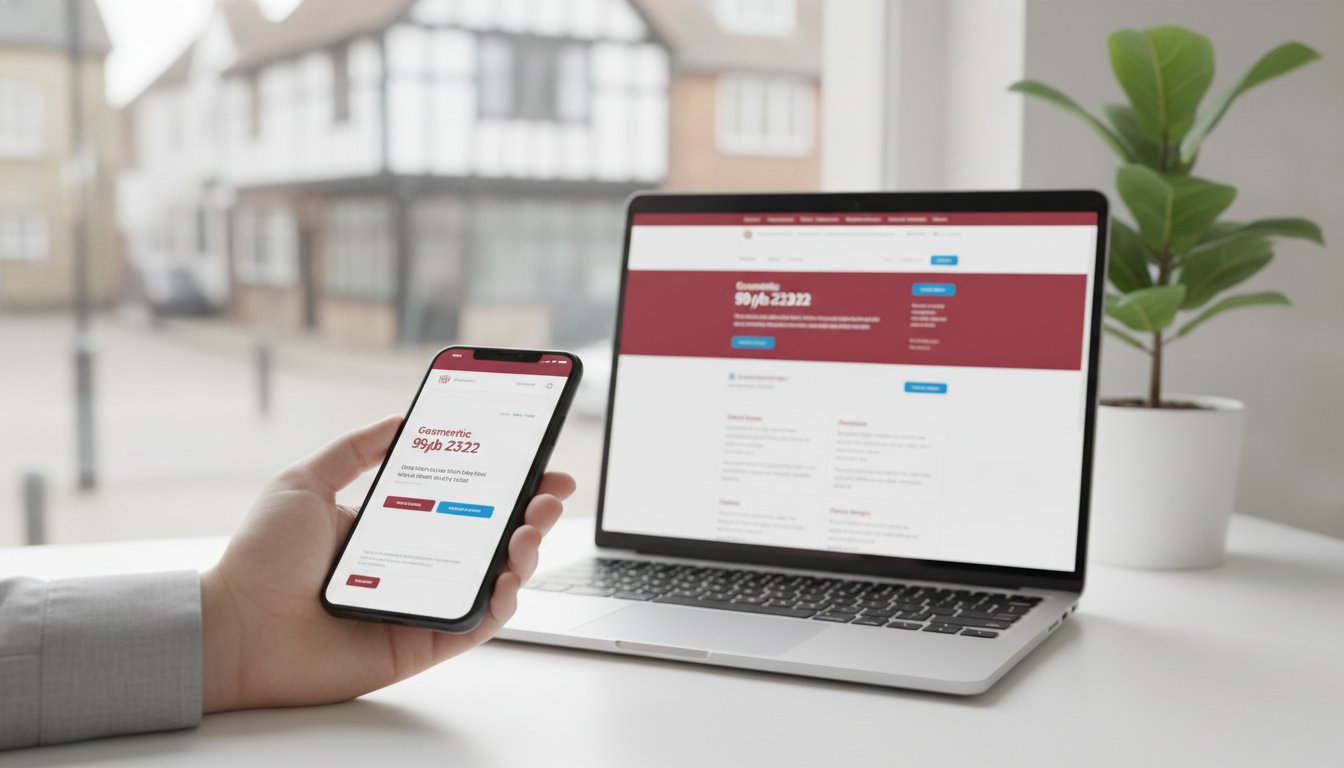
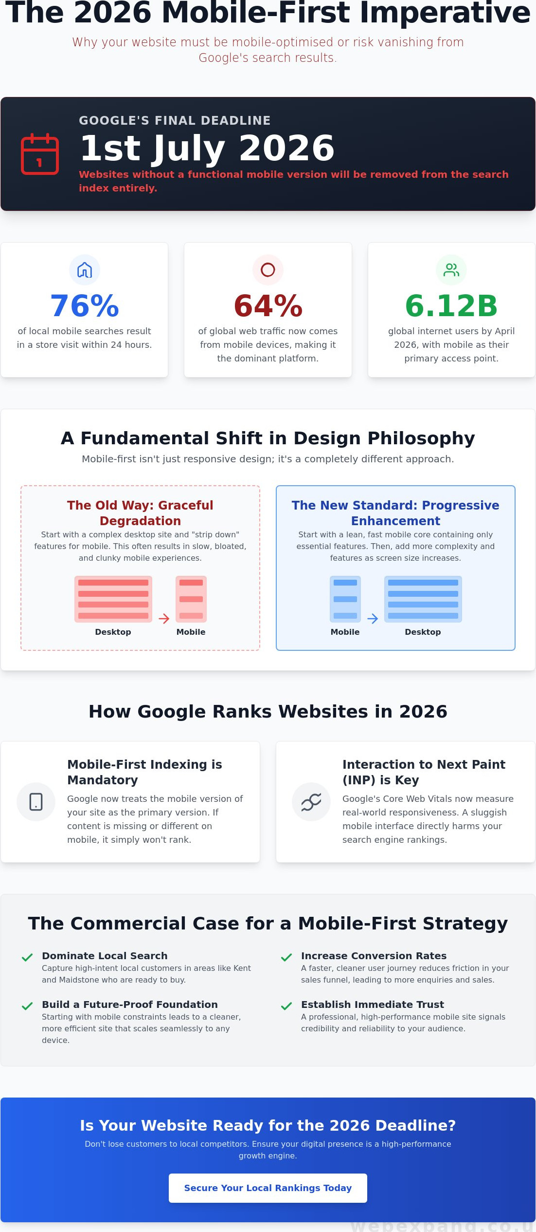
By July 1, 2026, your business website will either be mobile-optimised or it will effectively cease to exist on Google. This isn’t just another minor algorithm update; it’s a hard deadline where websites without a functional mobile version are being removed from the search index entirely. You likely already feel the pressure as local competitors in Maidstone and Kent secure the top spots, whilst your own mobile conversion rates remain stagnant. It’s exhausting to deal with confusing technical jargon when all you want is a digital presence that actually performs.
We understand that your website should be a catalyst for growth, not a source of frustration. This guide clarifies the mobile-first web design importance in the current landscape, providing you with a clear roadmap to dominate local search results and scale your operations. We will break down the critical shift to Interaction to Next Paint (INP) metrics, explore how to meet the latest 2026 accessibility standards, and show you how to build a site that captures the 76% of local mobile searches that lead to a store visit within 24 hours.
Key Takeaways
- Discover why starting with mobile constraints leads to cleaner, more effective digital architectures that scale seamlessly to desktop environments.
- Learn how Google’s 2026 indexing protocols and updated Core Web Vitals prioritise mobile performance as the primary driver for your local search visibility.
- Understand the shift from “graceful degradation” to “progressive enhancement” to build a website that functions as a high-performance growth engine.
- Recognise the mobile-first web design importance in reducing friction within your sales funnel and establishing immediate trust with your local Kent audience.
- Gain a practical two-step framework for auditing your current mobile performance and mapping out the essential user journeys that drive conversions.
What is Mobile-First Web Design and Why is it Essential in 2026?
Mobile-first web design isn’t just a technical preference; it’s a strategic philosophy that prioritises the mobile user journey before scaling up to desktop environments. For years, businesses treated mobile users as a secondary audience, often “stripping down” a complex desktop site to make it fit a smaller screen. In 2026, this approach is a recipe for commercial failure. True mobile-first design flips the script. It treats the smartphone experience as the primary foundation of your digital presence. By building for the smallest screen first, you ensure that your core message and most vital conversion paths are never lost in a sea of desktop-only clutter.
The mobile-first web design importance becomes clear when you consider that “constraint breeds innovation.” When you design for a six-inch screen, there’s no room for fluff or decorative distractions. This physical limitation forces a level of precision that desktop-first projects often lack, leading to cleaner, more effective sites that load faster and convert better. With 6.12 billion internet users globally as of April 2026, the sheer volume of mobile traffic demands this foundational shift. According to Scalify.ai, mobile devices now account for approximately 64% of global web traffic, making it the dominant medium for business-to-consumer and business-to-business interactions alike.
The Evolution of Mobile Browsing Behaviour
The way people interact with the web has fundamentally shifted. “On-the-go” search is no longer a trend; it’s the default human behaviour. We live in an era of micro-moments where users in Kent or Maidstone demand immediate, high-precision answers whilst commuting or between meetings. Mobile-first design is the practice of sketching, prototyping, and coding for mobile devices at the start of any project. This ensures your brand is ready to meet these high-intent moments with zero friction. If your site feels clunky or slow during these brief windows of opportunity, you don’t just lose a click; you lose a customer to a competitor who prioritised the mobile experience.
Mobile-First vs Responsive Design: Clearing the Confusion
Whilst many associate this shift with Responsive Web Design, the technical implementation in 2026 has evolved. Traditional responsive design often relies on “max-width” media queries, which take a heavy desktop site and try to hide elements as the screen gets smaller. This often results in “squashed” layouts and bloated code that slows down mobile devices. In contrast, a mobile-first approach uses “min-width” media queries to build up from a lightweight mobile core. This ensures your site remains incredibly fast and agile. For businesses investing in bespoke web design in Kent, this distinction is the difference between a site that merely functions and one that dominates the market.
The SEO Impact: How Mobile-First Design Drives Google Rankings in Kent
Google’s ranking systems now treat the mobile version of your site as the primary source of truth. Under Mobile-first indexing, Googlebot crawls and evaluates your content based on how it appears on a smartphone. If your mobile layout hides critical text or lacks the structured data present on your desktop version, you risk a significant drop in visibility. From July 1, 2026, this becomes a binary requirement; sites without a functional mobile presence will simply be removed from the index. This shift underscores the mobile-first web design importance for any business aiming to maintain a competitive digital footprint.
Performance metrics have also evolved to prioritise real-world user interaction. The transition to Interaction to Next Paint (INP) as a Core Web Vital means Google now measures the latency of every tap and click on your mobile interface. A site that feels sluggish on a mobile network sends negative signals to search engines, leading to lower rankings even if your desktop performance is exemplary. By focusing on a mobile-first architecture, you optimise for the hardware limitations of handheld devices, ensuring your site remains responsive and maintains high “dwell time,” which is a crucial indicator that your content satisfies user intent.
Dominating Local Search in Maidstone and Beyond
Local SEO is inextricably linked to mobile usability. Most “near me” queries in Kent are performed by users looking for immediate solutions, making fast-loading contact details and maps essential for conversion. Strategic SEO services Kent align your design with these search patterns, ensuring your business appears in the coveted local map pack. If your current mobile presence feels like an afterthought, it’s time to consult with our strategic team to bridge the gap between design and discoverability.
AI-Search Readiness: The 2026 Frontier
The rise of AI-driven search snapshots has introduced a new layer of complexity to SEO. These AI engines prefer lean, semantic HTML structures to extract information efficiently and present it in real-time summaries. A mobile-first build naturally provides this clean code, making your content more accessible to AI crawlers. Speed is the ultimate currency in this new era; if your site doesn’t load instantly on a mobile connection, AI search engines are unlikely to feature your brand as a primary source, directly impacting your long-term lead generation.
Progressive Enhancement: Building High-Performance Growth Engines
In the professional digital landscape of 2026, the methodology behind your site’s construction determines its long-term viability. Progressive enhancement is the strategic choice to build a robust, high-performing mobile core before adding complex layers for desktop users. This approach stands in direct contrast to “graceful degradation,” an outdated practice where developers build for desktop and hope the site doesn’t break when viewed on a smartphone. By starting with the mobile experience, you ensure that every visitor receives the essential information they need, regardless of their hardware’s capabilities.
Adopting this methodology significantly reduces technical debt. It forces your team to focus on clean, efficient code from day one, ensuring your Kent business website remains agile as new technologies emerge. The mobile-first web design importance is particularly evident here; it acts as a filter that removes unnecessary bloat. When you invest in a bespoke solution rather than a generic template, every line of code serves a specific commercial purpose, creating a foundation that is as scalable as it is reliable.
Content Architecture for the Mobile User
Strategic content placement is vital for conversion. You must prioritise the “indispensable” information, ensuring that your customers see your primary value proposition and call-to-action immediately. We also utilise the “Thumb Zone” principle, placing critical interactive elements where they are naturally easiest to reach on a handheld device. Choosing bespoke web design in Kent allows you to map these user journeys with precision, outperforming standard templates that often bury lead-generation forms in hard-to-reach corners of the screen.
Speed as a Strategic Advantage
Every second of load time directly impacts your bottom line. In a fast-paced UK market, speed is a competitive differentiator that separates industry leaders from those left behind. We implement advanced techniques like lazy loading, aggressive image optimisation, and streamlined scripts to ensure your site is a high-speed growth engine. Industry data confirms that 53% of mobile visits are abandoned if a page takes longer than three seconds to load. By prioritising a mobile-first architecture, you eliminate the bloat that causes these delays, protecting your marketing investment and ensuring your brand remains the first choice for time-poor customers.
Beyond UX: The Commercial Case for Prioritising Mobile Users
Investing in a mobile-first approach is a calculated commercial decision that directly influences your bottom line. Whilst user experience is a vital component, the primary objective is to reduce friction within your sales funnel. Every unnecessary tap or poorly sized button is a potential exit point for a customer. By removing these hurdles, you create a streamlined path to conversion that captures intent at the exact moment it peaks. For a professional firm in Sevenoaks or Tunbridge Wells, a polished mobile presence does more than look good; it signals reliability and technical competence, which are the cornerstones of consumer trust.
Your digital marketing efficiency also hinges on this foundation. Whether you are investing in PPC or broader Google Promotion, your landing page performance determines your return on ad spend. High-quality mobile-first designs lead to better Quality Scores, which directly lower your cost-per-click and improve your ad positioning. This financial advantage allows you to outbid competitors whilst maintaining a healthier margin. The mobile-first web design importance is also evident in the omnichannel journey. Many users will discover your brand on a smartphone during a brief window of downtime; if that first impression fails, they are unlikely to return to your site on a desktop to complete a high-value transaction.
Converting Mobile Traffic into Kent Leads
To turn casual browsers into qualified leads, your site must facilitate immediate action. We implement simplified mobile forms and prominent click-to-call buttons that remove the effort from the enquiry process. For businesses looking for web design in Maidstone, this focus on local conversion success is essential. Streamlining the checkout process for e-commerce solutions is equally critical, as UK shoppers increasingly abandon carts that require excessive data entry on small screens. Ensuring your mobile-first e-commerce experience is friction-free is no longer optional for growth.
Reducing Bounce Rates and Improving ROI
Nothing kills a conversion faster than “pincer-zoom” navigation. If a user has to manually resize your content to read it, they will leave within seconds, wasting the marketing budget you spent to bring them there. A mobile-first approach ensures that your content is perfectly framed from the start, significantly reducing bounce rates. This strategy is also more cost-efficient in the long term. Rather than managing and updating multiple versions of a site, you maintain one high-performance asset that serves your entire audience. If you are ready to professionalise your digital presence, you should contact our strategic team to discuss a tailored growth plan.
Implementing a Mobile-First Strategy for Your Business
Implementing a mobile-first strategy is a precision task that transforms your digital presence from a static brochure into a high-performance asset. Recognising the mobile-first web design importance is the first step toward securing your market share in 2026. To begin, you must audit your current performance through Google Search Console to identify existing mobile usability errors. Once you understand the baseline, map out the “essential” user journey. For a mobile visitor, this usually involves finding a specific service or contact method with minimal clicks; any obstacle here is a lost opportunity.
The next phase involves developing a mobile-first wireframe. This process prioritises content hierarchy and load speed over decorative elements. After the mobile core is perfected, you can scale the design up for desktop users, ensuring your brand’s core message remains consistent across all screen sizes. Crucially, you must maintain content parity; your mobile version must contain the same depth of information as the desktop site to satisfy Google’s indexing requirements. Finally, conduct rigorous testing on real physical devices. Browser simulators often fail to replicate the tactile experience or the hardware limitations of a mid-range smartphone, making real-world verification indispensable.
The Role of Professional Web Design
DIY website builders often fail to deliver true mobile-first architecture because they rely on “drag-and-drop” modules that create excessive code bloat. This technical clutter slows down your site and damages your search rankings. Partnering with an experienced web design agency in Kent provides you with the technical expertise needed to build a lean, high-performance site. We provide jargon-free advice and organise the entire transition, ensuring your new site is built for industry leadership rather than just basic functionality.
Ongoing Monitoring and Optimisation
The mobile-first web design importance extends far beyond the initial launch. Digital landscapes evolve, and user behaviour shifts, meaning your site requires constant refinement based on real-time data. We use heatmaps and conversion tracking to identify where mobile users might be encountering friction, allowing for precise adjustments that protect your ROI. Your choice of website hosting also plays a critical role here. Secure, high-speed hosting is the engine room of your mobile performance, ensuring that your optimised code isn’t held back by slow server response times.
Future-Proof Your Business with Mobile-First Leadership
The 2026 digital landscape leaves no room for hesitation. As Google’s July 1 indexing deadline approaches, the mobile-first web design importance is now tied to your very existence in search results. By prioritising the mobile user journey and optimising for Core Web Vitals like Interaction to Next Paint, you aren’t just improving aesthetics; you’re building a high-performance engine that converts local Kent traffic into measurable growth. Success in this environment requires a precise balance of technical speed and strategic content hierarchy.
Since 2004, Webexpand has provided bespoke, jargon-free web design tailored for businesses ready to scale and dominate their sector. With over 20 years of expertise and a specialised focus on Google promotion and SEO-driven results, we act as your strategic partner in navigating these technological shifts. Don’t let technical debt or outdated structures hinder your progress. Contact Webexpand today to discuss your mobile-first growth strategy and ensure your brand remains at the forefront of the market. We’re ready to help you broaden your horizons and achieve lasting industry leadership.
Frequently Asked Questions
What is the difference between mobile-first and responsive design?
Mobile-first is a strategic design philosophy; responsive design is the technical method used to achieve it. A mobile-first approach involves designing for the smallest screen first and then adding complexity for larger devices through progressive enhancement. Traditional responsive design often does the opposite by starting with a desktop layout and stripping away elements to fit a smartphone, which frequently results in slower load times and a cluttered user experience.
Will a mobile-first website still look good on a desktop or laptop?
Absolutely; a mobile-first site scales up beautifully to larger screens. By establishing a clean and focused core on mobile, we can then add “bells and whistles” for desktop users without compromising the underlying speed. This ensures your brand looks professional and authoritative whether viewed on a six-inch smartphone or a high-resolution monitor, maintaining a consistent visual identity that reflects your status as a market leader.
How does mobile-first design affect my Google ranking in Kent?
Google primarily uses the mobile version of your site for indexing and ranking. In a local context, the mobile-first web design importance is magnified because most “near me” searches in Kent occur on smartphones. If your mobile site is slow or difficult to navigate, Google will penalise your visibility, making it nearly impossible to outrank competitors who have prioritised their mobile performance and Core Web Vitals.
Is mobile-first design more expensive for a small business?
The initial investment for a mobile-first site is comparable to any professional bespoke build, but it offers superior long-term value. By focusing on a single, high-performance architecture, you reduce technical debt and the need for frequent, costly fixes. It’s a strategic move that protects your marketing budget by ensuring higher conversion rates and lower bounce rates, ultimately delivering a much stronger return on your digital investment.
How can I tell if my current website is mobile-first?
You can identify a mobile-first site by its performance and structure. Use Google Search Console to check for mobile usability errors or perform a speed test; mobile-first sites typically load essential content in under three seconds. Technically, these sites use “min-width” media queries to build up the layout, ensuring the experience is fast and fluid rather than just a “squashed” or resized version of your desktop page.
Do I need a separate mobile app if I have a mobile-first website?
For most businesses, a high-performance mobile-first website removes the need for a separate app. A well-designed site provides the speed and functionality users expect without requiring them to download anything from an app store. This streamlines your digital presence and ensures your content is easily discoverable through search engines, which is vital for attracting new customers and capturing immediate search intent in Kent.
How long does it take to develop a mobile-first website?
A bespoke mobile-first project typically takes between eight and twelve weeks from the initial audit to the final launch. This timeframe allows for the strategic mapping of user journeys, precise wireframing, and rigorous testing on real devices. We focus on delivering a high-quality growth engine that is built to last, rather than rushing a template that fails to meet the rigorous performance standards of 2026.
Can I convert my existing desktop-focused site to mobile-first?
Whilst it is technically possible to retrofit an old site, we usually recommend a rebuild to ensure peak performance. Attempting to convert a desktop-heavy site often leaves behind “code bloat” that slows down mobile devices and complicates future updates. Starting fresh allows us to implement a clean architecture that fully leverages the mobile-first web design importance, ensuring your business is ready to dominate the 2026 digital landscape.