
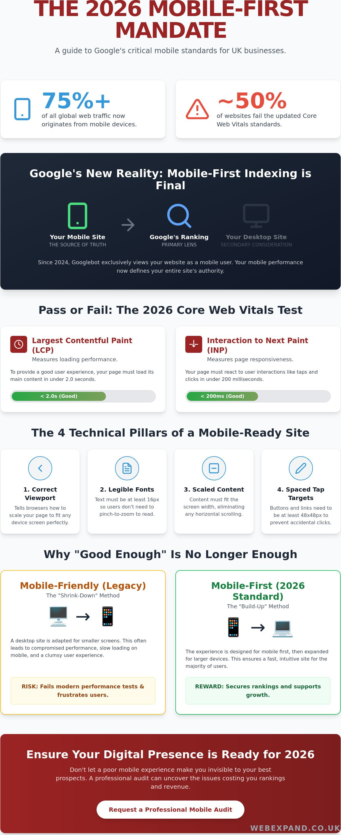
Over 75% of global web traffic now originates from mobile devices, yet nearly half of all websites still fail to meet the updated Core Web Vitals thresholds established in March 2026. You’ve likely felt the frustration of high bounce rates or waded through confusing developer jargon whilst watching local competitors climb the search results. It’s exhausting to build a digital presence only to wonder, is my website mobile friendly enough for google, or am I simply invisible to my best prospects?
We believe your website should be a precision tool for growth, not a source of technical anxiety. This guide will demystify Google’s 2026 mobile-first standards and provide a clear pass or fail audit of your current performance. You’ll learn exactly how to optimise your mobile UX and fix the specific technical failures, such as slow Interaction to Next Paint (INP) scores, that are currently costing you rankings. We’ll give you the confidence to ensure your digital presence fully supports your 2026 expansion goals.
Key Takeaways
- Understand how Googlebot now prioritises the mobile version of your site as the primary lens for determining your search ranking authority.
- Identify the critical technical benchmarks required to answer the question, is my website mobile friendly enough for google, including viewport configuration and content scaling.
- Discover why legacy responsive designs often fail modern performance tests and how a mobile-first approach secures your digital presence.
- Learn how to conduct a professional DIY audit using Google Search Console to uncover real-world user experience issues that drive high bounce rates.
- Gain clarity on whether to repair your current site or invest in a bespoke website design to achieve sustainable SEO growth.
What Does Mobile Friendly Actually Mean for Google in 2026?
Mobile-friendliness in 2026 is no longer a design preference; it’s a fundamental technical requirement. It describes the seamless adaptation of your content across every possible device, from a compact smartphone to a tablet in landscape mode. This is often achieved through Responsive Web Design, which uses fluid grids and flexible images to ensure your layout remains intact regardless of screen size. For businesses asking, “is my website mobile friendly enough for google,” the answer lies in whether your site provides a frictionless experience for the automated Googlebot. This crawler now views and indexes your pages exclusively as a mobile user, making your desktop version a secondary consideration.
Google’s ranking systems rely heavily on field data from real-world users to judge your performance. In 2026, the benchmarks are strict. Your Largest Contentful Paint (LCP) must be under 2.0 seconds, and your Interaction to Next Paint (INP) must stay below 200 milliseconds. These metrics, known as Core Web Vitals, are the primary indicators Google uses to determine if your site deserves a top spot. If your site feels sluggish or buttons don’t react instantly to a thumb tap, you’ll likely struggle to maintain visibility in competitive search environments.
The Evolution of Mobile-First Indexing
Google finalised its shift to mobile-first indexing in 2024. This means your desktop site is now essentially a backup for the mobile version. For local businesses in Maidstone and across the UK, this transition has redefined the digital landscape. If your mobile version contains less content or suffers from slower performance than your desktop version, Google will penalise your entire digital presence. Your mobile site is now the “source of truth” for your brand’s authority and ranking potential. You cannot afford to treat it as an afterthought.
Why “Good Enough” is No Longer Enough
A site that merely “works” on a phone is no longer sufficient to dominate your sector. There is a vast difference between a functional site and one that excels in user experience. A poor mobile experience, such as tiny text or overlapping elements, directly damages your brand authority and erodes trust with potential leads. High-performance mobile design is the engine behind successful Google Promotion strategies. When your site is effortless to navigate, bounce rates drop and conversions rise. This proves to Google that your business is the most relevant result for users. To succeed, your site must be precise, fast, and intuitive.
The 4 Technical Pillars Google Checks on Your Site
To determine if your digital presence is truly robust, you must look beyond aesthetics. Google evaluates specific technical markers to decide the ranking of your pages. If you are asking, “is my website mobile friendly enough for google,” you need to verify these four pillars: the viewport meta tag, content scaling, font legibility, and tap target spacing. These aren’t just suggestions. They are the benchmarks for professional web performance in 2026.
Configuring the Viewport Correctly
The viewport meta tag is the most basic yet critical element. It tells the browser how to adjust the page’s dimension and scaling to the device’s width. Without this tag, a smartphone browser assumes a desktop width. This causes your site to appear zoomed out and impossible to navigate. Common mistakes in bespoke code include setting a fixed width rather than using “width=device-width”, which prevents the site from scaling naturally on newer, larger smartphones. You can verify your own settings by right-clicking your page, selecting ‘Inspect’, and looking for the “meta name=viewport” tag within the HTML head section.
Readable Text and Touch Elements
Readability and interaction are where many sites fail modern audits. Google recommends a minimum font size of 16 CSS pixels for body text. Anything smaller forces users to pinch and zoom, which triggers high bounce rates and damages your authority. Equally important is the physical space between interactive elements. Following the Eight Principles of Mobile-Friendliness, tap targets like buttons and links should be at least 48×48 pixels. This spacing prevents the “fat finger” error, where a user accidentally clicks the wrong link because elements are too close together. If you find your Search Console reporting “Clickable elements too close together,” your tap targets are likely the culprit.
Horizontal scrolling remains one of the most significant UX failures in Google’s eyes. It occurs when fixed-width elements, such as large images or complex tables, exceed the width of the mobile screen. Modern CSS techniques, including container queries, now allow elements to respond to the size of their parent container. This provides much finer control than traditional media queries and ensures your content fits perfectly on any device. If your current layout requires users to scroll sideways to read a sentence, your ranking potential is being throttled. Achieving these technical standards requires a combination of precise coding and strategic design. If you’re concerned about your site’s current performance, you should request a professional technical audit to identify and resolve these hidden friction points.
Mobile-Friendly vs. Mobile-First Design
Many business owners assume that if their site isn’t “broken” on a phone, they’ve succeeded. However, to truly answer the question, is my website mobile friendly enough for google, you must understand the shift from mobile-friendly to mobile-first design. Mobile-friendly sites are often legacy desktop sites that have been retrofitted to shrink or move elements around. Whilst they might pass a basic check, they often carry a heavy burden of desktop-only code that slows down performance. In contrast, a mobile-first approach starts with the smartphone experience and scales up to the desktop. We specialise in bespoke website design that prioritises this architecture, ensuring your foundation is built for the way 2026 users actually browse.
The Performance Gap
Legacy responsive sites often fail modern tests because they load heavy desktop assets and then simply hide them with CSS. This is a fatal mistake for mobile performance. Google sees all the data your site forces a phone to download. Even with the widespread adoption of 5G across Kent, mobile data speeds are variable. High-performance sites in 2026 use aggressive image optimisation and Lazy Loading to ensure that only the content currently on the screen is being processed. This precision directly impacts your Kent SEO rankings by reducing the time it takes for a page to become interactive. Mobile-First Design is the strategic prioritisation of the smartphone user experience.
User Behaviour and the “Thumb Zone”
Designing for mobile requires an understanding of physical ergonomics. Most users navigate with their thumbs, meaning the most critical interactive elements should reside in the “Thumb Zone” at the bottom and centre of the screen. We recommend using sticky headers to keep navigation accessible and bottom-anchored call-to-actions that remain within easy reach. For Kent businesses looking to capture local leads, simplifying mobile forms is a high-impact move. Every extra field you remove increases your conversion rate on a mobile device. If you are still wondering, is my website mobile friendly enough for google, look at your contact forms; if they are a chore to fill out on a small screen, you are losing money to more modern competitors.
How to Audit Your Own Site (The DIY Checklist)
Auditing your own performance is the first step toward reclaiming your search authority. To truly answer the question, is my website mobile friendly enough for google, you must look at the data Google already holds on you. Start with Google Search Console’s Page Experience report. This dashboard provides a consolidated view of how real-world users experience your site, based on field data collected at the 75th percentile. Unlike lab tests, this reflects the actual behaviour of your visitors whilst they browse from their smartphones.
Next, run your URLs through PageSpeed Insights (PSI). In 2026, the benchmarks for a “Good” score are precise. Your Largest Contentful Paint (LCP) must be under 2.0 seconds, and Interaction to Next Paint (INP) must be under 200 milliseconds. If your site triggers intrusive interstitials, such as full-screen pop-ups that block content, Google will penalise your mobile ranking. These are often used for newsletter sign-ups, but they create a significant friction point for mobile users that damages your brand’s reliability.
Interpreting Google Search Console Data
The Mobile Usability report in Search Console is your most valuable diagnostic tool. It highlights specific errors like “Text too small to read” or “Clickable elements too close together.” When reviewing these errors, distinguish between site-wide issues and single-page glitches. A site-wide issue usually points to a flaw in your global CSS or template, whilst a single-page error might be caused by a poorly formatted image or a broken table. Fixing these errors is not just about clearing a report; it is about ensuring your digital presence supports your growth goals.
The Manual “Kent Business” Stress Test
Automated tools often miss contextual usability issues that a human user feels instantly. Perform a manual stress test by attempting to book a service or buy a product whilst walking. This simulates a busy user on the go. Evaluate if your local SEO Kent keywords are visible immediately without excessive scrolling. If your Maidstone or London contact details are not “tap-to-call,” you are creating unnecessary hurdles for your prospects. A mobile-friendly site must be a conversion engine, not just a static brochure. If your audit uncovers significant failures, you should book a professional technical consultation to restore your competitive edge.
Fixing Mobile Failures with Strategic Optimisation
Once your audit is complete, you’ll likely identify a few cracks in your mobile performance. The natural instinct is often to patch these issues, but incremental repairs to an outdated site can quickly become a false economy. It’s often more cost-effective to invest in a bespoke website design than to keep paying for technical fixes on a platform that wasn’t built for a mobile-first world. A modern rebuild allows us to strip away the bloated code that slows down your Interaction to Next Paint (INP) scores and replace it with a lean, high-performance architecture.
We view mobile architecture as the foundation of every successful Google promotion campaign. If your site’s foundation is weak, even the best SEO strategy will struggle to deliver results. By building with mobile precision from the start, we ensure your site is ready for the technical demands of 2026 and beyond. This isn’t just about passing a test; it’s about transforming your digital presence into a growth engine that outperforms your competitors.
Tailored Solutions for Kent Businesses
Businesses across Sevenoaks, West Malling, and the wider Kent area often fall into the trap of using “off-the-shelf” templates. Whilst these might look modern on the surface, they frequently fail Google’s mobile-friendly tests after just a few months of use. These templates are built for the masses, not for the specific performance needs of your industry. We offer jargon-free, strategic advice to help you understand where your current site is failing and how a tailored solution can protect your local market share.
Broadening Your Horizons with Webexpand
At Webexpand, we are deeply invested in your progress. We don’t just provide services; we act as a strategic partner to help you dominate your sector. If you are still asking yourself, is my website mobile friendly enough for google, it is time to stop guessing and start measuring. Our team is ready to help you identify hidden ranking blockers and move toward industry leadership. We invite you to organise a consultation today to discuss how we can broaden your horizons and deliver the measurable outcomes your business deserves.
Secure Your Digital Future with Mobile Precision
Google’s 2026 standards leave no room for ambiguity. We’ve established that a mobile-first architecture and perfect Core Web Vitals scores are now the baseline for any business that intends to scale. Moving beyond a legacy site that merely “works” on a phone to a high-performance digital presence is essential for long-term SEO stability. If you’re still wondering, is my website mobile friendly enough for google, remember that your real-world user data from the Chrome User Experience Report is the ultimate judge of your authority.
Since 2004, our team has built a reputation for providing jargon-free advice and results-driven SEO strategies for UK businesses. We specialise in bespoke, high-performance Kent web design that prioritises mobile usability as a core growth engine. Don’t let technical friction points or high bounce rates stall your progress. Get a Professional Mobile SEO Audit from Webexpand and ensure your digital presence is fully optimised for the challenges of the modern landscape. We’re ready to help you broaden your horizons and dominate your sector.
Frequently Asked Questions
Does Google penalise websites that are not mobile-friendly?
Google doesn’t issue a manual “penalty” in the traditional sense, but it uses mobile-friendliness as a primary ranking signal for all searches. Since the full implementation of mobile-first indexing, your mobile site’s performance determines your position in the search results. If your site provides a poor experience on a smartphone, you’ll naturally see a decline in visibility as Google prioritises competitors who offer a superior mobile experience.
How can I check if my website is mobile-friendly for free?
You can verify your site’s performance using free tools like PageSpeed Insights and the Page Experience report within Google Search Console. These platforms provide real-world data on how visitors interact with your pages at the 75th percentile. Running these checks helps you determine, is my website mobile friendly enough for google, by highlighting specific technical failures that require immediate attention.
What is the difference between responsive design and mobile-friendly design?
Mobile-friendly design is a general term for any site that works on a phone, whilst responsive design is the specific technical method used to achieve it. Responsive sites use flexible grids and CSS to reorganise content automatically based on the user’s screen size. In 2026, we focus on mobile-first architecture, where the smartphone experience is the primary build priority rather than a desktop afterthought.
Why does my website pass the test but still feel slow on mobile?
A site can pass a basic layout test whilst failing on critical Core Web Vitals like Interaction to Next Paint (INP). Passing the layout check only means your elements fit the screen; it doesn’t guarantee they are fast. If your site feels sluggish, it’s likely due to unoptimised images or heavy JavaScript that delays the page’s ability to react to user inputs.
Do I need a separate mobile app for my Kent business?
Most Kent businesses don’t require a separate mobile app to dominate their local sector. A high-performance, bespoke website design is usually more effective for capturing leads and improving search rankings. We focus on creating web-based solutions that provide an app-like experience without the high development costs and barriers to entry associated with native mobile apps.
Will a new mobile-friendly design improve my SEO rankings in Maidstone?
Implementing a modern, mobile-first design will significantly enhance your local search visibility. Google prioritises user experience when ranking businesses for location-based queries in Maidstone and the surrounding areas. By ensuring your prospects can navigate your site effortlessly, you reduce bounce rates and send positive signals to Google, which directly supports your broader Google Promotion goals.
How much does it cost to make a website mobile-friendly?
The investment required varies based on whether you are patching an existing site or commissioning a full rebuild. Whilst minor CSS adjustments might resolve simple errors, a comprehensive transition to a mobile-first architecture requires a more strategic approach. We focus on delivering tailored solutions that offer the best long-term financial performance rather than temporary, low-cost patches that fail after a year.
What are the most common mobile-friendly errors in Google Search Console?
The most frequent issues reported include “Text too small to read” and “Clickable elements too close together.” These errors occur when font sizes fall below 16px or buttons lack the 48×48 pixel spacing required for easy interaction. Another common failure is “Content wider than screen,” which usually results from fixed-width elements that force an awkward horizontal scroll for the user.